Readers of the 23 November 2015 New York Times interactive graphic – “The Climate Change Pledges Are In. Will They Fix Anything?” – may appreciate some resources that support the data in the story:
FAQs on the New York Times interactive graphic
Q: Why, in the section from the NY Times graphic shown below on China, does the line on the graph not peak? The text says that carbon dioxide emissions will peak by 2030.
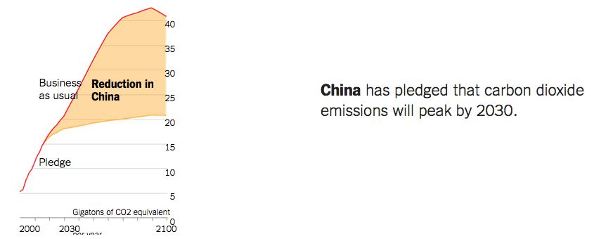
A: China’s official INDC includes: “To achieve the peaking of carbon dioxide emissions around 2030.” In the modeled scenario, carbon dioxide emissions peak but the other greenhouse gases (primarily methane, but also N2O and the f-gasses) continue growing over time, increasing total CO2 equivalent emissions in this graph from below 20 GT/year up over 20 GT/year from 2030 to 2100.
Q: Is the expectation that CO2 peaks but does not decline post 2030? (from @BradJohnson)
A: The pledge does not include decline but we have explored that possibility in the Climate Scoreboard — check out the scenario called Ratchet 2.